Starlink telemetry is available through IBIS. Similar functionality to that offered in the Starlink Portal is available. However, IBIS allows this to be accessed by customers’ end users.
Telemetry is accessible to users with roles that include the Provisioning_StarlinkTelemetry permission.
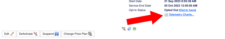
To access telemetry statistics for a Starlink terminal, navigate to the Card / Terminal Details screen for the required terminal and click on the Telemetry Charts… link at the lower right of the screen.
Header
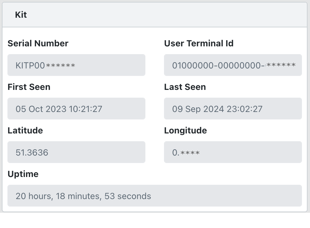
The Kit section shows the terminal identification, the first/last seen date/time and the uptime.

The Telemetry section above the charts provides selections to choose the time periods for the telemetry charts. As the chosen period gets longer the aggregation time also increases to keep the data volumes manageable.
- 15 seconds aggregation for 15 minutes and 1 hour time periods
- 1 minute aggregation for the 3 hours time period
- 5 minutes aggregation for 24 hours, today, yesterday and 48 hours time periods
- 60 minutes aggregation for 7 days and 14 days time periods
Chart Settings
Click the ‘gear’ icon at the top right of the header to change the look and feel of the charts.
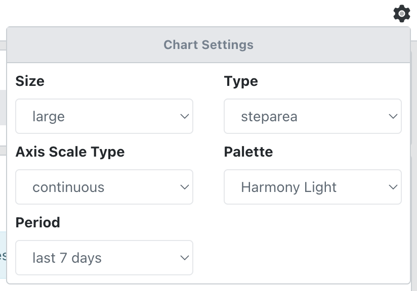
Reducing the size of the charts alters the height of the charts so that you can see more on your screen at the same time. The smallest size removes the title and statistical summary.
The Axis Scale Type allows you to choose between logarithmic, continuous (linear) or discrete vertical scales.
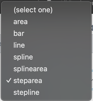
There are various chart types to choose from:
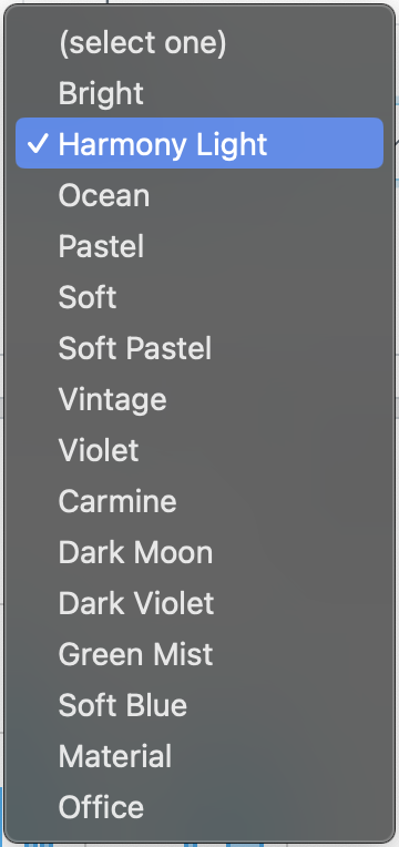
There are various colour palettes available:
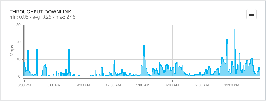
Throughput Downlink
Shows a chart with the minimum, maximum and average downlink speeds for the terminal during the selected period.
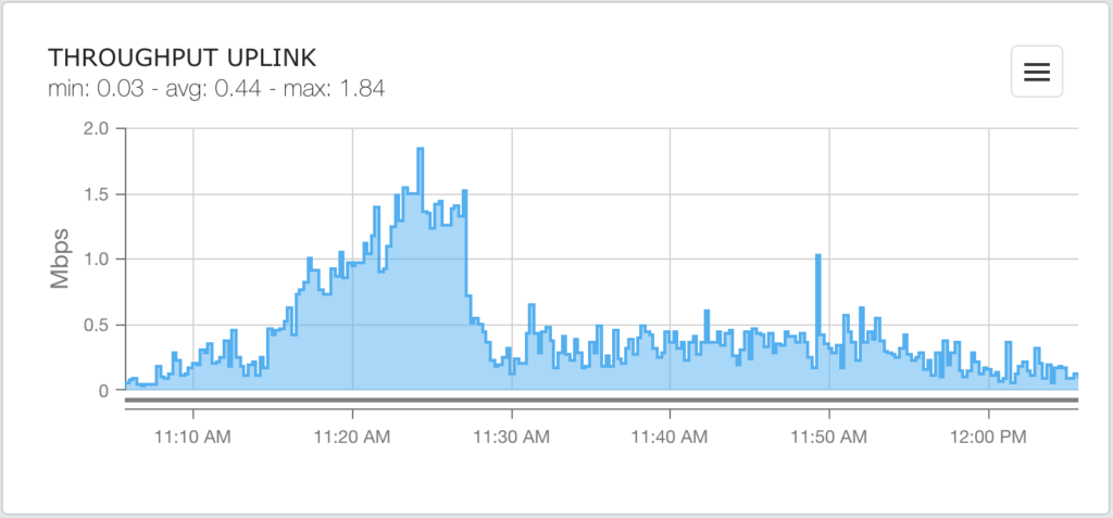
Throughput Uplink
Shows a chart with the minimum, maximum and average uplink speeds for the terminal during the selected period.
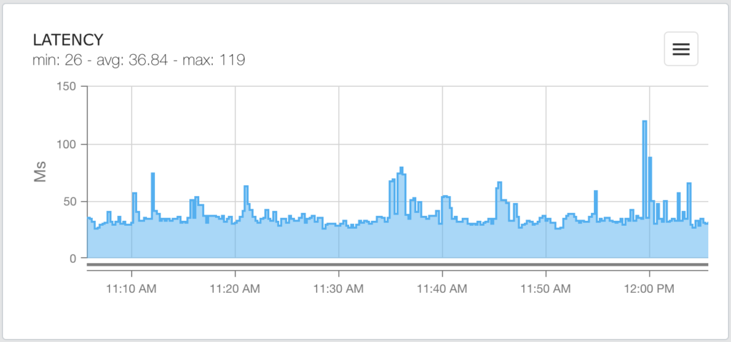
Latency
Shows a chart with the minimum, maximum and average latency for the terminal during the selected period.
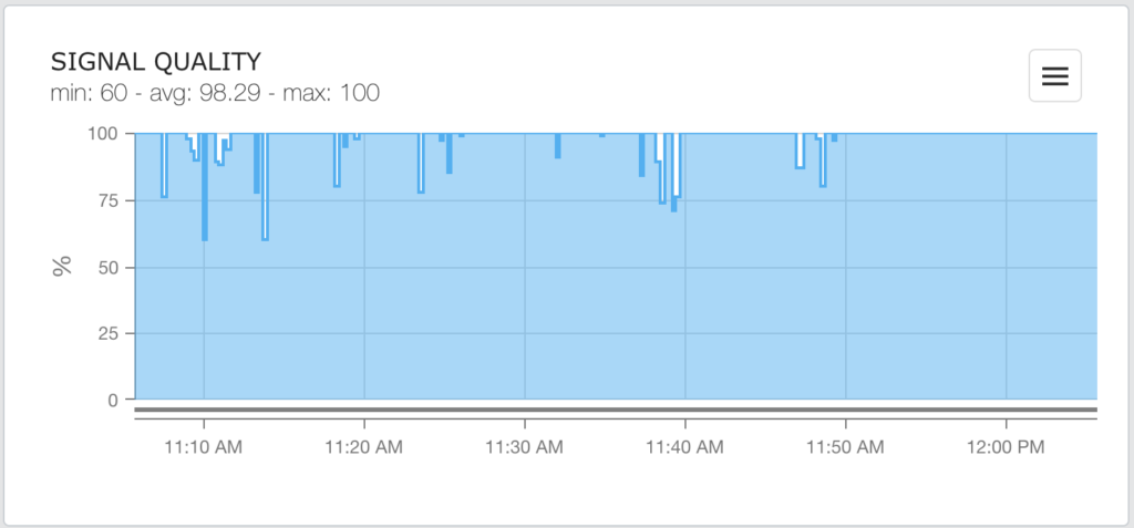
Signal Quality
Shows a chart with the minimum, maximum and average signal to noise ratio as a percentage for the terminal during the selected period.
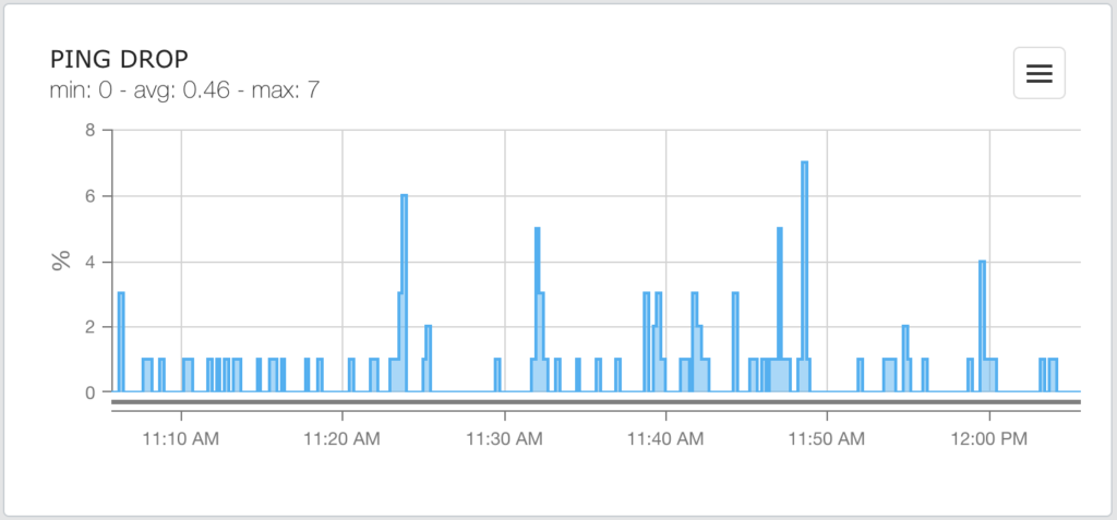
Ping Drop
Shows a chart with the minimum, maximum and average percentage of ping drops for the terminal during the selected period.
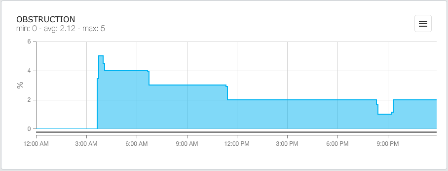
Obstruction
Shows a chart with the minimum, maximum and average obstruction percentage for the terminal during the selected period.
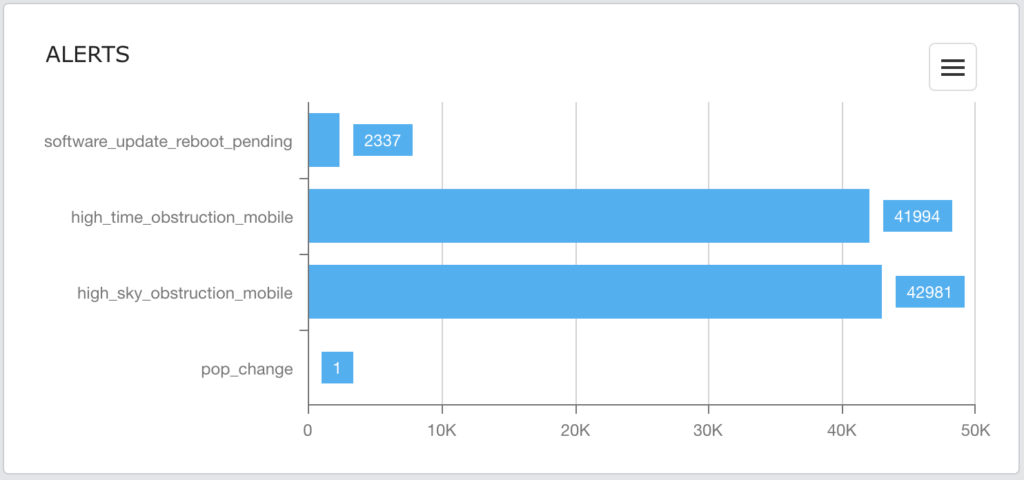
Alerts
The Alerts bar chart shows the number of alerts of each type generated by the terminal during the selected period.
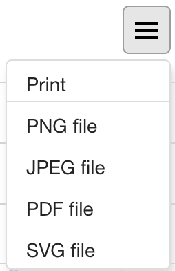
Share a Chart
Use the ‘hamburger’ icon at the top right of each chart to print or export the chart.
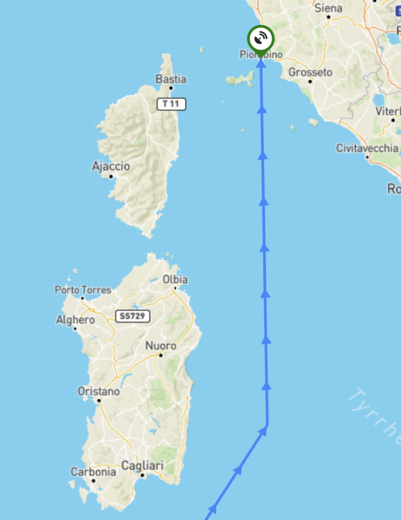
Map
Starlink terminals can be viewed on a map based on their reported locations.
Navigate to:
Provisioning -> Starlink -> Map
Terminals can be shown for all or selected customers. Clicking on a kit shows its properties in the right pane: kit number, latitude, longitude and date and time of its last report.
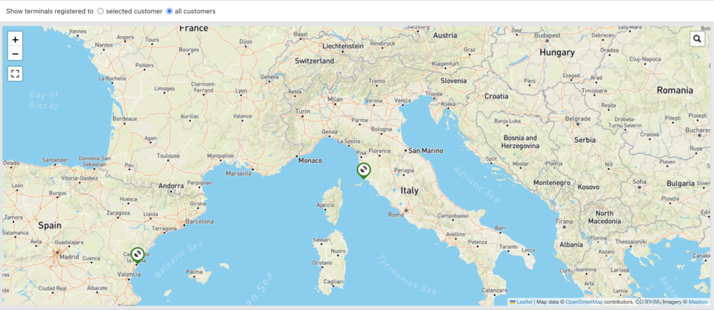
Mobile kits also show their recent track.